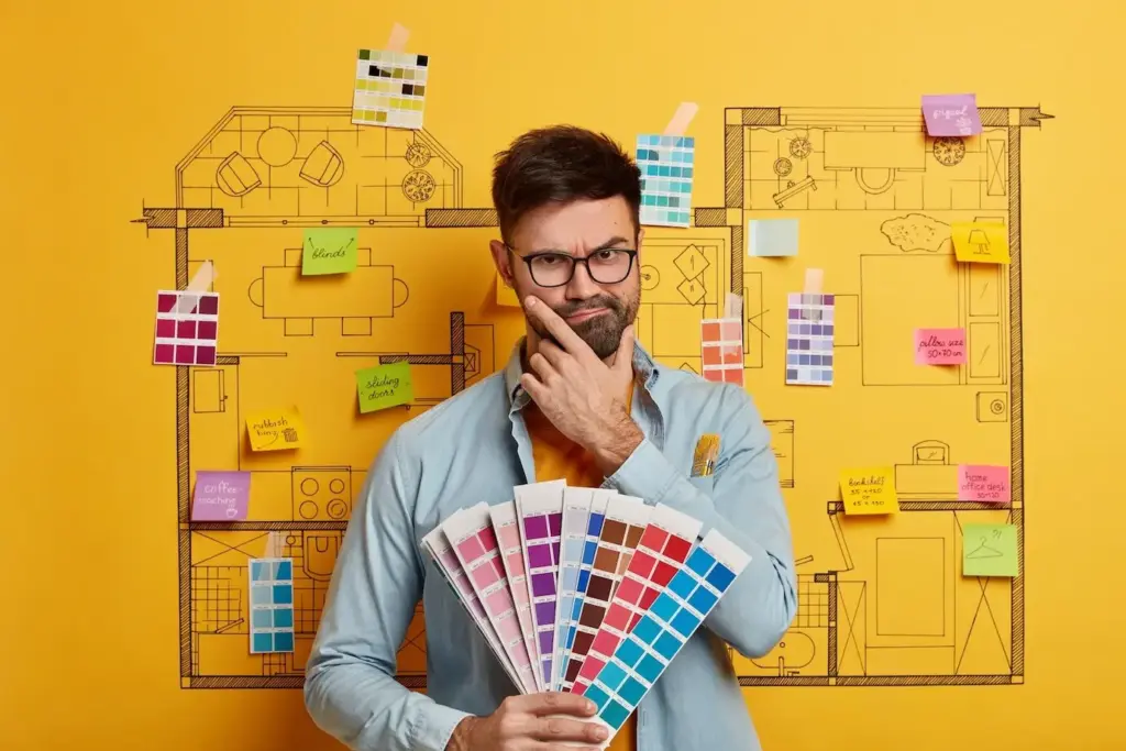
Select one grounding neutral, two companion neutrals, and three accent colors that echo through cabinetry, textiles, and art. Use proportion rules to allocate saturation by zone and function. Validate under multiple light sources and times of day, then document swatches with finish schedules everyone can trust.
Limit species and metals to a disciplined roster, repeating them strategically to anchor memory. Introduce contrast through scale, joint detail, or pattern orientation rather than random novelty. Track porosity, slip ratings, and patina trajectories so kitchens, baths, and entries age gracefully while still feeling intentionally related.
Standardize color temperature families and dimming protocols, then layer ambient, task, and accent sources that highlight consistent materials. Align beam spreads with circulation paths and sightlines. Specify controls that enable scenes, ensuring evenings feel cohesive from entry to bedroom without sacrificing mood, energy savings, or accessibility.
All Rights Reserved.